BRAND IDENTITY | NAMING | WEBSITE | PACKAGING | ADVERTISING CAMPAIGN
Brazil is growing in health awareness, a nutritionist entrepreneur took the opportunity to launch her healthy food line SõFit.
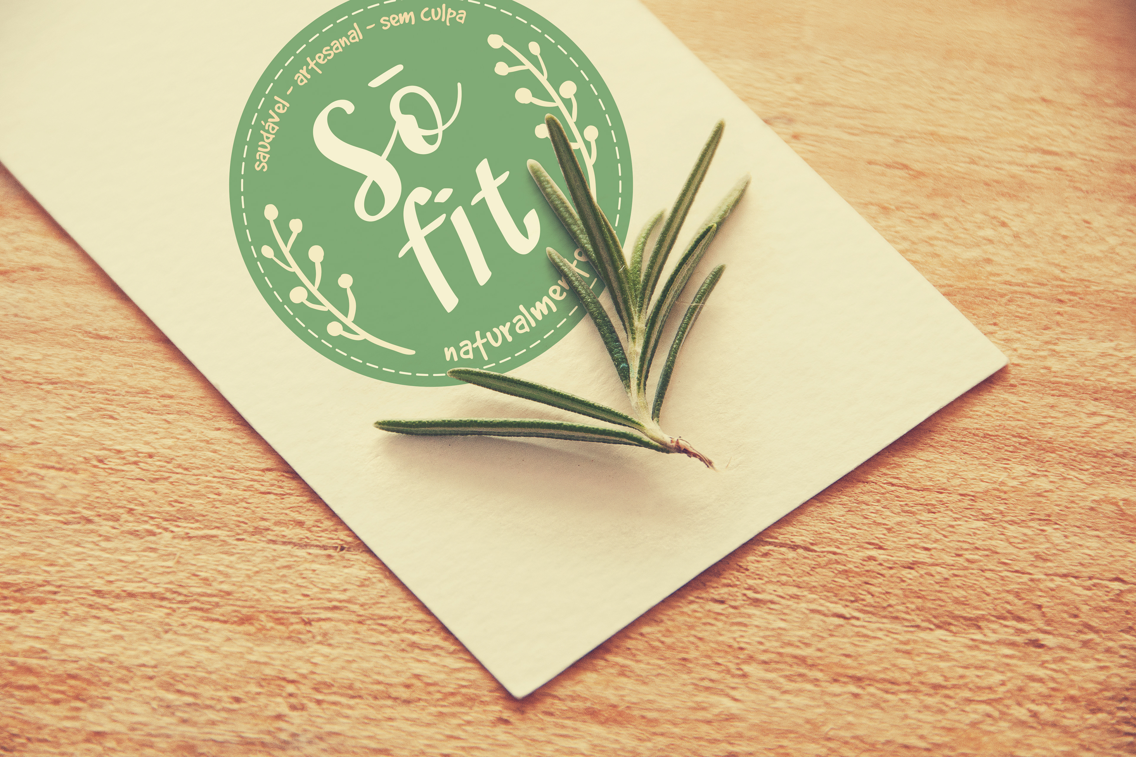
We created a brand with a fun personality reflected in the naming and colors. Playing with the sound of the letter O with the diacritic mark tilde. Sounding like Sõu, which means "I'm" in Portuguese. To add some fun, the mark tilde also is a halo, because the products are so good that is guilt free.
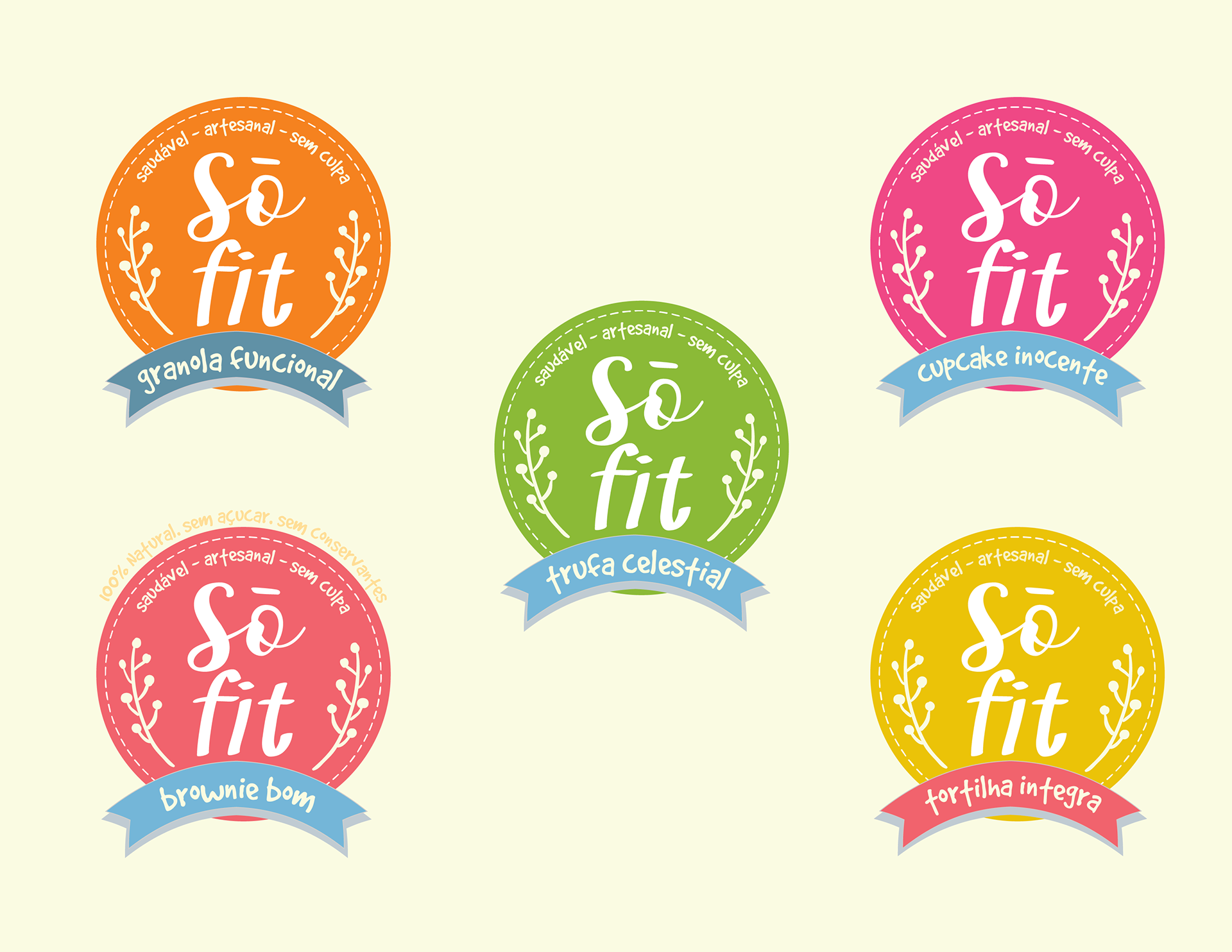
The Brand Identity also included packaging with a wide color scheme, a perfect match for the Brazilian vibrant culture. Some of the marketing materials we designed for SõFit were a portfolio of products, posters, point of purchase display, and in-store signage.